

In an era of data-driven decision-making, the ability to present and interpret data clearly is increasingly important. One tool available to both novices and experts alike is the scatter chart. It presents an effective visual aid for uncovering patterns, trends, and correlations within a data set. Keep reading to learn more about the scatter chart and its significance in data visualization.
Understanding the Power of Visualized Data
Today’s generation is data-rich but information-poor. The vast amounts of data require transforming into a comprehensible format, making visualized data crucial. It is not only aesthetically appealing but also efficient in communicating complex details.
Data visualization makes dense and complex data more accessible, understandable, and usable for everyone. Viewers can grasp shifts, trends, and outliers faster when they’re demonstrated visually.
Given the human brain’s ability to process visual information significantly better than plain text, visualizations can effectively highlight essential aspects of data.
Moreover, using visualizations such as scatter charts can simplify the process of explaining the insights and findings drawn from data analysis.
Dive into the World of Scatter Charts
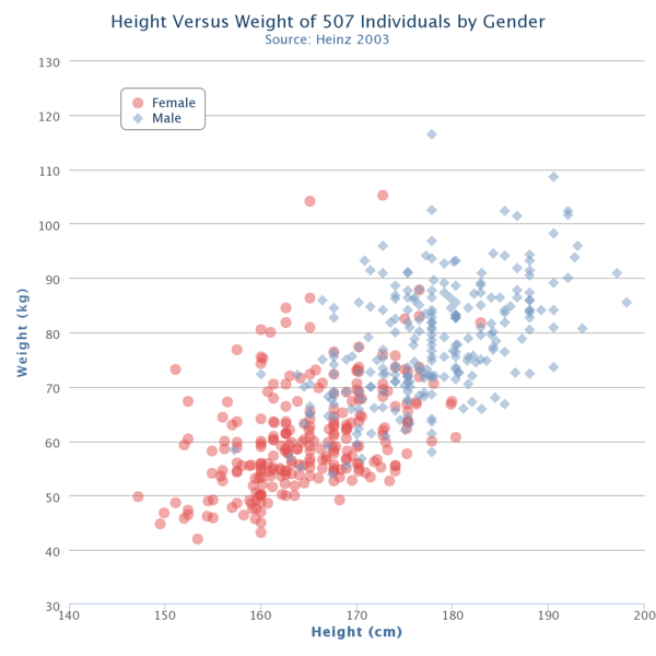
One such effective resource to visualize data is the scatter chart. A scatter chart is a two-dimensional graph that displays individual data points organized along horizontal and vertical axes. One of the primary advantages of scatter charts is their ability to display a large number of data points without any overlap. This feature makes them excellent for identifying correlations between different variables.
Scatter charts are exceptional tools for illustrating the relationship between two variables, helping to identify trends, concentrations, and outliers within the data. Thus, a well-created scatter chart can ease the task of interpreting complex data and enhance data-informed business decisions.
Key Elements that Make a Scatter Chart Engaging
The first crucial element of a scatter chart is the data point. Each data point displayed on the scatter chart represents an individual entity or event. The second element is the axes; the horizontal and vertical axes illustrate the value attributes that you want to compare or contrast.
The third key element is the trend lines or curves. These are used to highlight the overall direction of the data points, helping the viewer quickly understand the trend in the data.
The last essential element is labeling; providing clear labels for both axes and data points aids in understanding and avoids confusion among viewers.
How to Leverage Scatter Charts for Data Presentation
Scatter charts are effectively used where you need to observe relationships in big data. For example, checking whether an increase in one variable corresponds to an increase in another variable.
They’re also employed when there’s a requirement to present a distribution of both variables simultaneously or when dealing with many data points and other graphical representation methods like bar charts or line charts are crowded. Scatter charts reveal the direction (positive, negative, or no direction), the form (linear or non-linear), and the strength (consistency) of the relationship between variables.
Advanced Software for Business
Understanding these elements can greatly assist in interpreting and leveraging the charts for optimal data presentation.
Real-World Examples of Engaging Data Presentation with Scatter Charts
In the healthcare industry, scatter charts could compare individual patient’s cholesterol levels to their age. Or, in education, a scatter chart may show the relation between a student’s hours of study and their examination score.
In the world of finance, scatter charts can display the relationship between a company’s monthly advertising expenditure and its monthly sales figures.
These are just a few examples of how scatter charts offer visual clarity in multi-variable data sets, making extraction of insights a simpler process.
By analyzing trends and disparities within these scatter points, businesses or individuals can develop strategies and take appropriate actions based on data analysis results.
Overall, the ability to construct and interpret scatter charts is a vital skill in our data-filled world. Not only do they condense complex information into an easily consumable format, but they also make correlations and trends visually apparent that might remain hidden in raw, unprocessed data.
This post was last modified on November 21, 2023 10:55 AM